Panda Express Mobile App Audit & Redesign
This is a project I worked on with another student Sophie during the BrainStation UXI Immersive Bootcamp. It was a quick two half day assignment. We picked Panda Express mobile app because it really needed a make over for their user experience. Panda Express is a chain of Chinese food restaurants. The role of its app was to order and pick up takeout food from their restaurants.
Project Scope
Tools
The Challenge
We did a careful study on the Panda Express app to identify any problems in the product experience and then to make UX/UI recommendations. The end goal was to redesign the app and turn the ordering process into a seamless experience.
Discovery
We conducted a thorough study of the app by testing the customer experience flow. We found out that the existing app was very hard to navigate and frustrating to place an order.
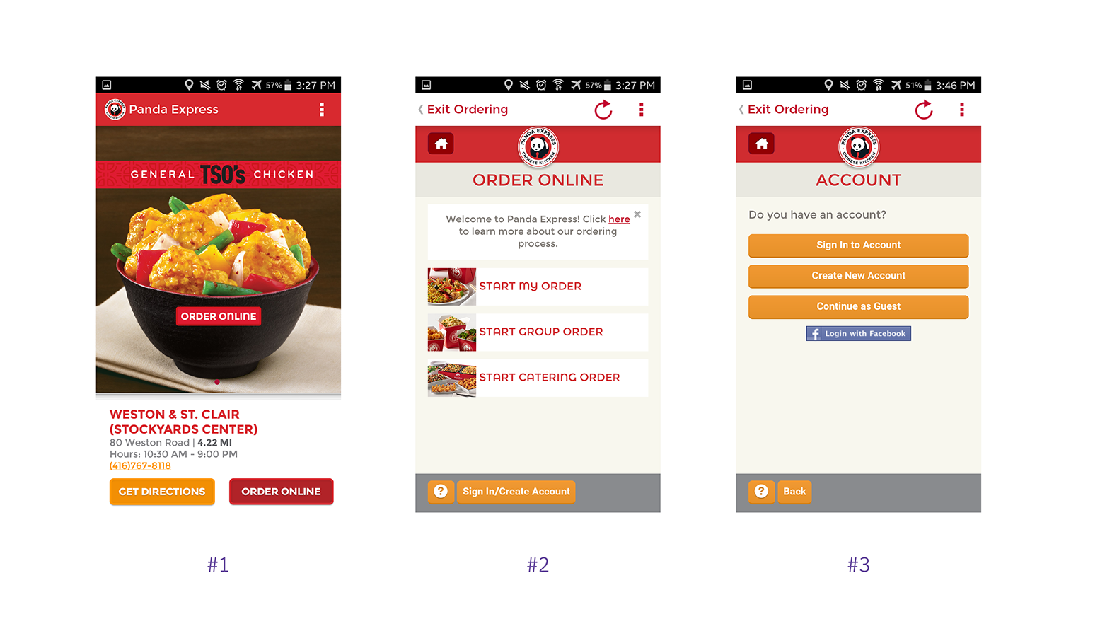
#1 Home screen:
- Basically the app was a Panda Express website being embedded in the app environment. When clicking on one of the ‘ORDER ONLINE’ buttons it took us to the website. Therefore the order task flow was not well designed.
- Having two 'ORDER ONLINE’ buttons on the same screen was confusing to the users.
#2 Order online screen:
- There was no onboarding to guide users to order up front. Users had to click to get to a different section for explanation to order.
#3 Account screen:
- There were too many items on the screen without any clear hierarchy.
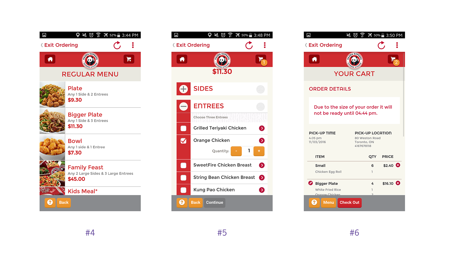
#4 – Regular menu screen:
The category names were inconsistent. The menu allow users to order only one item of its kind at a time.
#5 – Selecting item screen:
Only one combination of items can be ordered one at a time which was very inefficient. Bottom navigation is not intuitive and poorly designed. When adding quantity, it didn’t show the total.
#6 – Shopping cart screen:
The type was very small. Delete button was small. It was also hard to modify the order. It could not add quantity.
Redesign
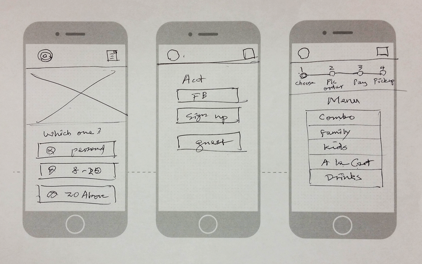
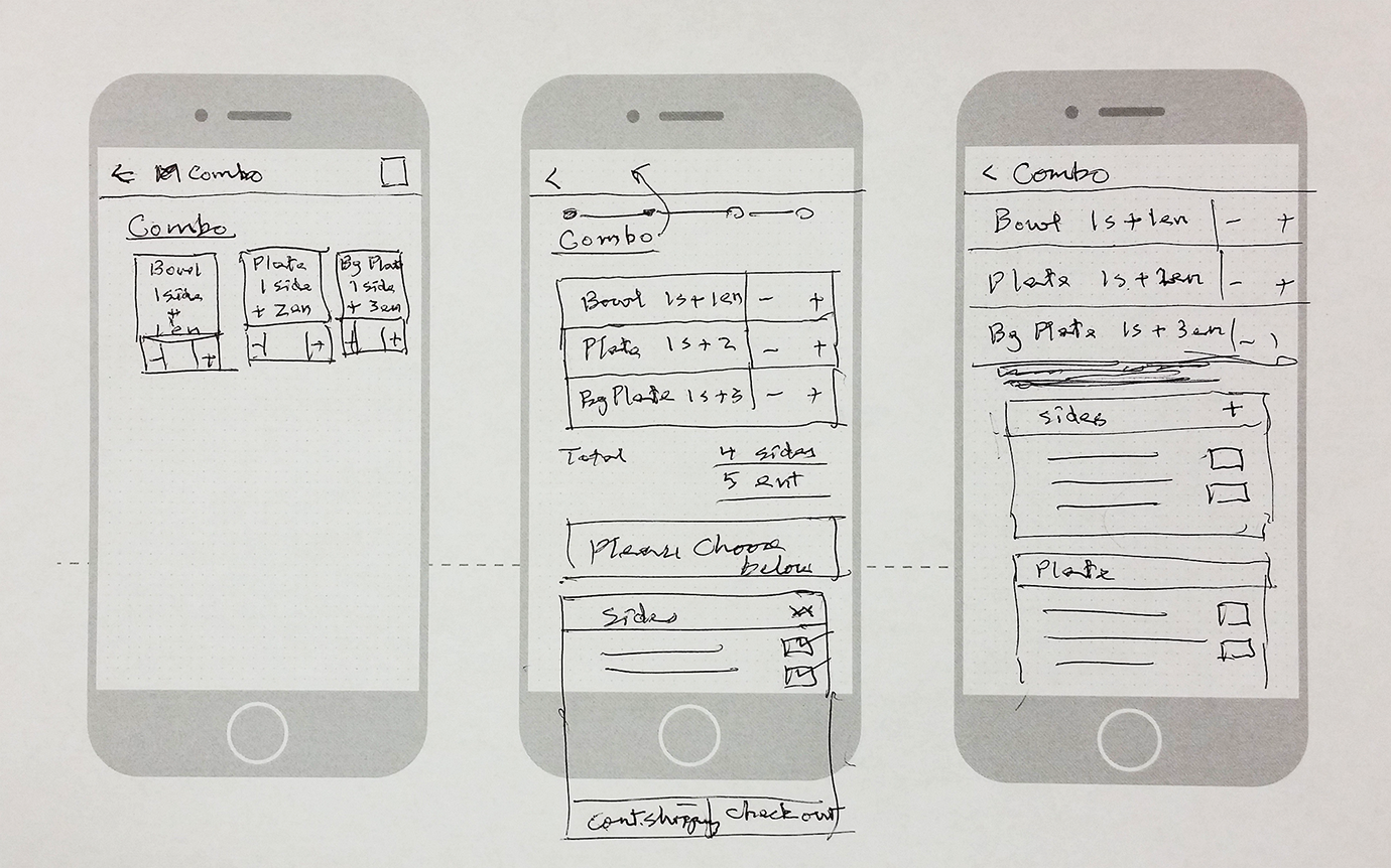
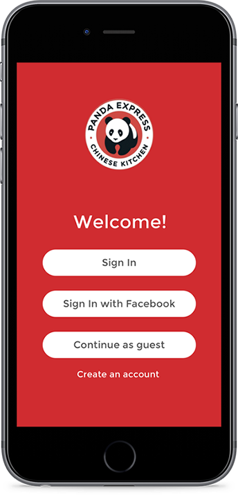
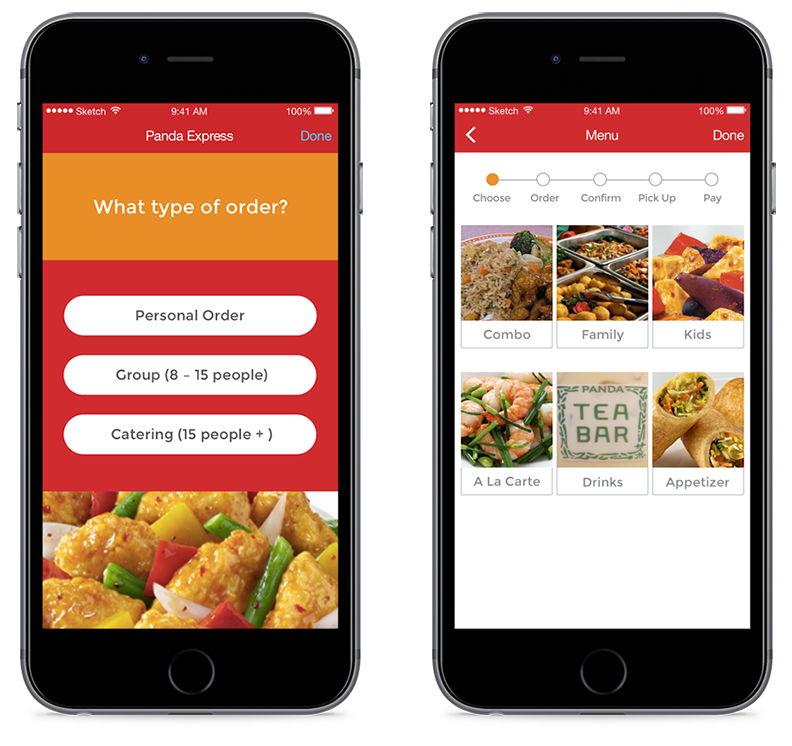
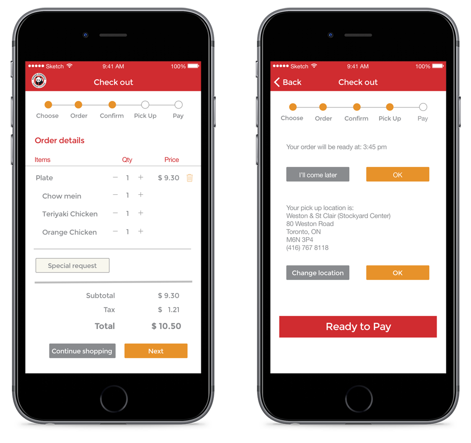
With limited amount of time, we decided to focus on the sign in, menu, combos and check out screens with a new visual look following their branding guides.
Redesign Opportunities
- to simplify the ordering process to make the task efficient and effective.
- to improve the navigation of the app so users won’t need to go all the way back when they make a mistake.
- to implement a progress bar to streamline and track the ordering process, instead of directing users to a different screen to instruct them how to order.
- to allow users to order all types of combos at once.
- to make it easy to modify or cancel an order during checkout.
- to move the pick up time and location to the checkout screen instead of having them at the beginning of the app.
Wireframes
Hi-fidelity Designs
After developing the wireframes, I worked on the menu and combos screens, and my partner Sophie worked on the checkout process screens.

Copyright © 2019 Lai-Kit Chan
