TKXS Website
TKXS, was founded through a merger between Technekes and XSin. Being a technology-driven B2B services company, TKXS provides demand generation, marketing and sales technologies, and rebate and incentive solutions. TKXS delivers solutions for agriculture, healthcare and manufacturing companies throughout North America.
The Challenge
- A new company website is needed to reflect the TKXS new brand and to set TKXS apart from their competitors. As the new brand was still evolving, the design of the website would further bring shape to the TKXS brand.
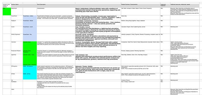
- The website serves as a marketing and an informational tools to reinforce their industry expertise in the agriculture, B2B, healthcare and industrial sectors. It needs to communicate the depth and breadth of TKXS’ services. At the time of the merger, TKXS has a total of 39 products and services, and more will be added. An intuitive navigation is needed for easy access to the contents.
- TKXS is growing rapidly. The website is also a tool to draw high quality professionals to join the team.
Project Scope
Tools
The Team
My Role
The Process
Research
I was brought on board to take over the design of the website. The previous designer produced the low-fidelity wireframes and moodboard. I pinpointed important steps the previous designer had missed and optimized the process. I started out by doing research to gain understanding who TKXS and their users are, and to ensure the website was going in the right direction.
Provided Wireframes & Moodboard
Persona Creation
Architecture and Navigation
Considerate thinking was put into designing the information architecture, grouping and naming of the products, and navigation. The navigation typography hierarchy is designed in a way that communicates the full spectrum of TKXS products. It was given an elegant look and flow for navigation by industry and by solution. The decision not to collapse the vertical product menu is to let the readers see the scope of TKXS capabilities at a glance without clicking when they are on a product page.

Site Map
Products Navigation
Mobile Devices Navigation
Visual design
Voice, tone and look-and-feel
Sophisticated, trustworthy, solid, classic, strategic, experienced and corporate are the voicing of the brand and the website.
Contents
I worked with the copywriter to ensure the copy works together with the images and layout, and ensure copy delivery. Messaging and contents were crafted carefully to detail TKXS’s extensive technology, platforms, solutions, approach and leadership team. The career page is the most visited web-page historically. Core values, corporate structure, and local community involvement were included to attract prospective employees.
Design exploration and Image Search
Several design options were explored before narrowing down to one chosen design. Bold sophisticated images were selected to tell the evolving story of TKXS. Large duo tone hero images are used, balanced with touches of TKXS blue, color icons, and the 4-color secondary images to reflect the corporate feel.
Visual Style Guide
Mock-ups and assets hand-off for engineering
Final mock-ups were output using the Adobe XD development tool. The website was engineered within the Hubspot platform. The lead developer was involved at the early stage of the process. We made some slight adjustment in certain elements due to the platform constraints. I worked with the lead developer during final coding to ensure design consistency and visual standards. I stopped after this stage. The QA department took over to perform the testing.
Take Away
- Researching, mapping out the persona, knowing the users/readers and listening carefully to the stakeholders are crucial steps to ensure the right direction.
- Ongoing communication within the cross functional team, stakeholders and third parties is a very important component for a smooth process, timely delivery and success of the project.
- It is important to involve the developers at an early stage and ongoing stages of the process. A good developer makes the final product shine.
Copyright © 2019 Lai-Kit Chan
